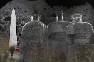
Sunday, 31 January 2016

Short Film

For my final piece I choose to make a short film. The concept was a Victorian ghost film that was only going to be about 2 minutes long.

These are a few of the pictures I took on location. It was a really great experience, a little stressful because I only had a couple of hours to film and it was freezing but overall worth it. I also learnt a lot from it especially in the editing process and about the benefits of finding a location,


Tuesday, 1 December 2015

London Trip

We went to London for an a-level art trip. These are some pictures of the landmarks that I took.   

South Bank
The Globe Theatre
Big Ben


As well as site seeing. We went to Tate Britain, Tate Modern and the V & A. The Tate Britain had lots of Victorian portraits that fit perfectly with my theme.
William Orpen
The Mirror
Sydney Starr
Study In Blue And Grey

Gwen John
Self Portrait
John Singer Sargent
Ena and Betty
 The one portrait that struck me the most was
William Rothenstein
The Dolls House


It seemed like the most gritty and eery. This makes it fit perfectly with the violent and
 dark time, that I'm focusing on. I really like the shadows on the man, it creates an uneasy feeling.

The V & A also had a lot of interesting Victorian pieces.
A Victorian Corset
A Victorian Dress

Looking at the clothing help me with seeing exactly what the fashion was like. This helps in fitting in with my alternative sketch book. (http://eleanorsophiewass.blogspot.co.uk/2015/10/alternative-sketch-book-idea.html)

There were also interior decor.
Victorian Sink
Victorian Room

Victorian Tempus Fugit Clock

I'm going to take some of the patterns from these to use on my alternative sketchbook. It was really helpful to go and look at all these exhibitions because its given me lots of ideas for both my sketchbook and sketchbook.  

Thursday, 12 November 2015

Ian Murphy Development

Ian Murphy is an artist I have looked at in my sketch book. He painting are done using graphite, oil paint and mixed media.


I tested 3D medium to create this mixed media effect. To make the 3D medium spread easily I mixed it with emulsion paint. I then used a heat gun to make it bubble up and become 3D.


I then used 3D medium on a larger scale, I put it in certain areas to make some pieces more 3D than others. I then used watercolour instead of oil paint. I used darker shades to make it fit in to my theme of Gothic Victorian, I also choose to paint a window inspired by one of Ian Murphy's paintings. I enjoyed developing Ian Murphy's idea into my own style and materials and I also enjoyed using 3D medium for the first time, its defiantly something I will use again.

Sunday, 1 November 2015

Beamish


Beamish is a open air museum that focus mainly on the Victorian times. I travelled to Beamish to get an idea of how everything worked in the past and get some more inspiration for my sketch book and alternative sketch book.

Here are some of the images I took:

These are from the pit village, where the mining took place


These pictures are from the town which includes shops and houses. So compared to the pit village it more upper class so the style is very different.


Going to Beamish was really helpful its given me lots of idea for final pieces and more sketch book pages because its shown me what it was actually like in Victorian times for two different classes of society. I'm going to look at the houses and decor in the inside and maybe draw some images from the photos I have taken. I also took lots of photos of text so that I can create a title sequence inspired by Ripper Street and the film series Sherlock Holmes.
Here is a link to the Beamish web site http://www.beamish.org.uk/  

Tuesday, 13 October 2015

Alternative Sketch Book Idea

My alternative sketch book idea is to sew my sketches and fabric samples into a corset then to turn it into a lamp. So I have looked at corset lamps that already exist.


I really love the use of old corsets or underwear being reused. For example the bottom left image, are named 'tramp lamps' and are sold on Esty. They made from recycling old underwear and adding lamps to the inside. Here is a link to the site https://www.etsy.com/uk/shop/tramplamps?section_id=5832179&ref=shopsection_leftnav_3  They remind me of the theatre and stage, I think its the use of reds and black.

I have also looked at Victorian lamps to see what colour and style my corset needs to be.


A lot of the lamps have this recurring beads hanging down from there edges. Red is the most common colour with the occasional oranges and blacks. I love how intricate the beading is on the lamp itself and also like the flower theme the seems to run through most of the lamps.

So I think I will use reds and blacks with my corset lamp as they are the most common for the Victorians but I will also include these beads to tie the corset to the traditional lamps. Yet I will also add my work sewn into the corset as an alternative sketch book.
 

Sunday, 11 October 2015

Mathieu Latour-Duhaime

Mathieu Latour-Duhaime is an artist who designs for 'Thief' a game set in Victorian England. The images are done digitally. I love how complex and detailed the images are what inspires me about the art is the slight hints of colour in certain places, it makes parts stand out and look more realistic this is a technique I will be looking at in my sketch book.


Wednesday, 30 September 2015

Photoshop

I took inspiration for the tv show 'Ripper Streets' opening titles. This is a programme set in Victorian London. I love the way all the images are overlapping it creates a messy and chaotic feel. I really like the use of colours, the blues lighten up the image and the reds bring out the feeling off danger and murder which is a big part of the show and of Victorian England.


By using these as inspiration I used photoshop to edit some photos I took in the style of these opening titles. I did this by overlaying my images and adding colour into the background layer. With the final image I added the candle and the rose in to the eye sockets of the skull by taking out the black and putting the images behind it the now empty space so that they appear in the eye.