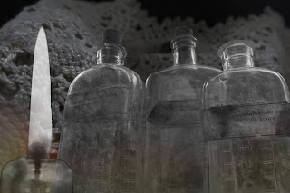
By using these as inspiration I used photoshop to edit some photos I took in the style of these opening titles. I did this by overlaying my images and adding colour into the background layer. With the final image I added the candle and the rose in to the eye sockets of the skull by taking out the black and putting the images behind it the now empty space so that they appear in the eye.
Wednesday, 30 September 2015
Photoshop
I took inspiration for the tv show 'Ripper Streets' opening titles. This is a programme set in Victorian London. I love the way all the images are overlapping it creates a messy
and chaotic feel. I really like the use of colours, the blues lighten up the
image and the reds bring out the feeling off danger and murder which is a big
part of the show and of Victorian England.
Friday, 11 September 2015
Photography
I've been experimenting with photography and the Av feature. The Av feature or the aperture controls how much light is shown in the picture, controlled by the lens. So for most of my pictures are on a high Av so less light is getting through so the picture is focus.
This is a photo of a skull that I took the aperture was high so less light was on the picture, this photo was also not using the setting macro so it is not as detailed as a photo with Marco.
This is a similar picture but taken with the macro setting and a black background. The change of background makes the black in the picture stand out making the picture as a whole feel darker and more morbid. The details are more precise this is because of the Marco setting. I enjoy this setting as it allows you to get so close and be able to see intricate details. I also much prefer the black background as it makes the skull stand out.
I also photographed medicine bottles. With these photos I again used the black background I think it helps in adding definition to the bottles. The wide photo of the bottle was taken not using the macro setting so the writing is not in focus. But I like the way the light hits the bottle from one side. The close up of the label was taken with the Macro setting I like how worn the label looks and how grubby the bottle is, it creates the impression of them being used a lot.
Tuesday, 8 September 2015
Hello
Hello, my name is Eleanor and I am doing A-level art. My topic is victorian gothic , I choose this because I saw this image on Pinterest and was inspired by how haunting and detailed it is, I also love how many stories it could tell and how many questions it asks. Who is the man? What city is it?
Some other images I saw and made me inspired were
I'm not sure what road I want to take with my sketch book but I love these images and hope to take some ideas from them. I will also look at victorian photography and spiritualism.
This is a link to my Pinterest Gothic Victorian board https://www.pinterest.com/EllieBob99/gothic-victorian-art-ideas/ Where you'll find all the images seen above.
Subscribe to:
Posts (Atom)